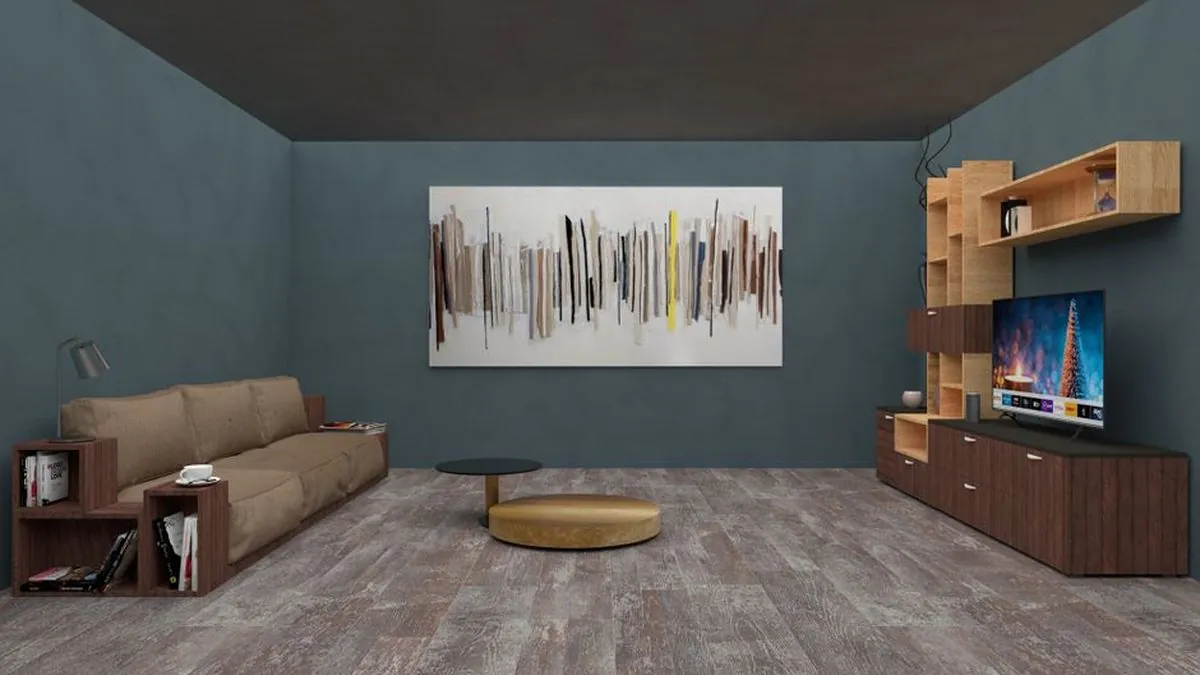
The best wall colour combination for an Indian home is one light base shade on most walls plus one deeper accent on a single wall, chosen for the light that room actually gets. In Chennai that usually means warm off-white or greige walls with olive, teal, terracotta or blue-grey as the accent, and a test patch on the wall before any painter is booked.
Our team at Style Well Interiors has been designing Chennai homes since 2013, and most of the repaints we are asked to fix come from choosing a pair in a showroom instead of in the room. The sections below cover light, room-by-room pairings, finish, testing and the mistakes to avoid.
How does Chennai light change wall paint colours?
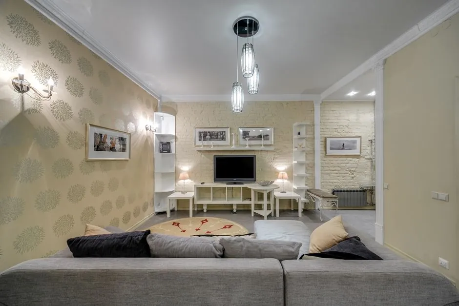
The same shade can look like three different colours on three walls of one flat. Chennai's hot weather season runs from March to May according to the Tamil Nadu Department of Economics and Statistics climate tables, so hard, bright daylight is the norm. Check which way each room faces before you pick anything.
- East-facing rooms get strong morning light. Cool greys, blue-greys and off-whites hold their shape, while warm yellows can turn brassy early in the day.
- West-facing rooms take harsh afternoon sun. Mid-depth shades with a little grey in them handle glare better than a pure bright colour.
- North-facing rooms usually get the most even, indirect light, which makes them the safest place for a deeper or more saturated accent.
- Shaded rooms behind a deep balcony or between two blocks need the lightest version of whatever you choose, or they read dull.
Which wall colour combination suits each room?
Each room does different work, so the balance of light and deep shade should change from room to room. The table below is the starting grid we use for a three-bedroom Chennai flat. The last column matters most, because the same two colours succeed or fail depending on which wall carries the darker one.
- Put the accent on the wall you look at, not the wall you sit against.
- Never put the deepest shade on the wall that holds the main window.
- Keep trim and ceiling in the base colour or a lighter tone of it.
| Room | Base (three walls) | Accent (one wall) | Accent placement |
|---|---|---|---|
| Living room | Warm off-white | Deep olive or terracotta | Wall behind the TV unit |
| Master bedroom | Soft greige | Muted teal or dusty rose | Headboard wall |
| Kids room | Pale cream | One bright block colour | Study or play corner |
| Kitchen | Light grey-white | None on walls | Colour goes in the shutters |
| Pooja room | Ivory | Warm gold or deep maroon | Niche or rear wall |
| Guest bedroom | Pale blue-grey | Slightly deeper blue-grey | Wall facing the door |
What is the best living room colour pairing?
A living room takes the most traffic, the most furniture and often doubles as the dining area, so the base has to survive two lighting moods. Our usual approach on a living room interior design project is one quiet base and one confident accent, with extra colour added through cushions and curtains.
- Warm off-white with a deep olive accent is the most reliable pairing; olive reads rich in bright light and does not go flat in the evening.
- Greige with terracotta suits teak and rosewood furniture and forgives a dusty week.
- Soft grey with charcoal looks crisp and modern but needs good artificial light, or the room feels heavy after dark.
- Ivory with a wood-tone feature wall swaps the painted accent for veneer or fluted panelling, which also hides scuffs at sofa height.
Which bedroom colour combination keeps a room restful?
A bedroom is seen at two extremes: early daylight and low lamp light. The pairing that works in both is almost always low in saturation, with the depth kept to one wall. Deep colour is not the problem; deep colour on all four walls of a 10 by 12 room is.
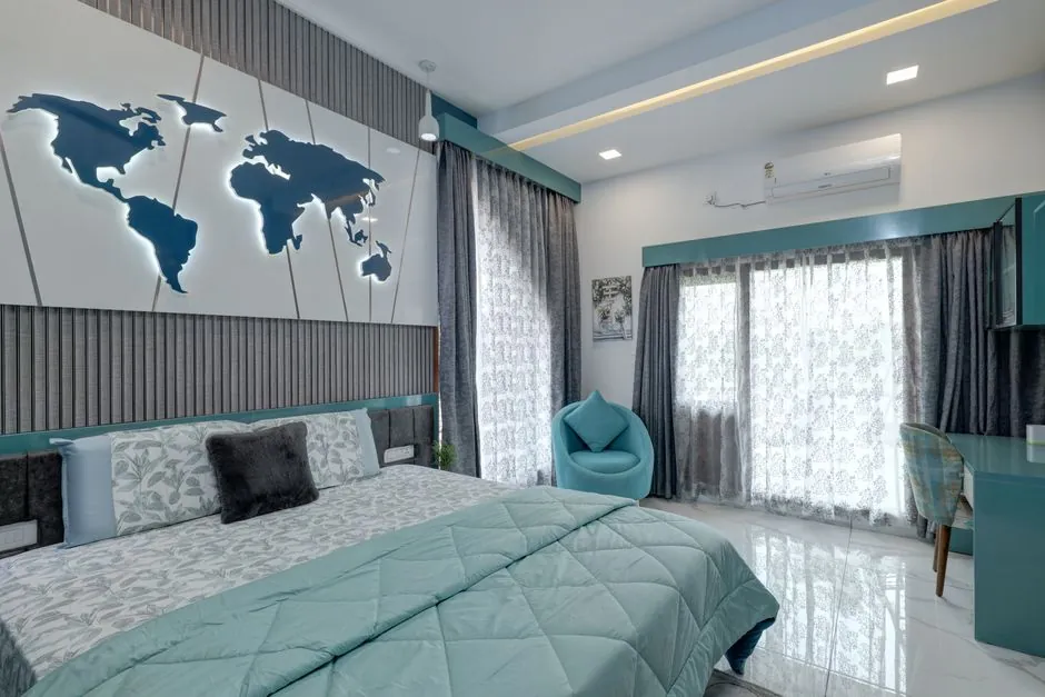
- Greige base with a muted teal headboard wall feels cool in a warm climate and flatters both wood and laminate wardrobes.
- Pale cream with dusty rose is soft without turning childish the way a true pink can.
- Off-white with a deep blue-grey is the safest dark accent for a west-facing room.
- Warm white throughout, with colour in the wardrobe shutters keeps a small room calm; our wardrobe design team often moves colour off the wall for this reason.
- Avoid a saturated accent on the wall opposite the window, because it reflects into the room and tints everything, skin tones included.
How do paint finish and sheen change a pairing?
Two walls in the identical shade can look like different colours if the sheen differs. In humid coastal air the finish also decides how well a wall survives wiping. The same state climate tables record morning relative humidity at Chennai's two observatories between 63 and 88 per cent from June 2020 to April 2021, so washability is not a minor point here.
- Keep the base matt so it reads deepest and softest.
- Give the accent at most a soft sheen.
- Reserve satin or semi-gloss for kitchens, bathrooms and skirting.
- Use textured paint on a single feature wall only, because it reads deeper than the swatch.
| Finish | How the colour reads | Best used on |
|---|---|---|
| Matt | Deepest and softest, hides wall undulation | Bedroom and living room bases |
| Soft sheen | Slightly lifted, mild reflection | Accent walls and passages |
| Satin or semi-gloss | Brighter and cooler than the swatch | Kitchens, bathrooms, skirting |
| Textured | Reads two to three shades deeper | Single feature walls only |
Which wall painting ideas add interest without a third colour?
Once the base pairing is settled, you can add interest without adding a third colour, which is where most schemes go wrong. These ideas all stay inside a two-shade palette and suit the compact rooms common in Chennai flats.
- Colour-drenching one small room puts walls, ceiling and trim in a single mid-tone, and works well in a powder room or study.
- Carrying the accent onto the ceiling of one bay lowers a tall room pleasantly.
- Paint on three walls, pattern on one keeps the palette tight; the paint is picked from the pattern.
If you want the pattern route, our wallpaper installation service levels and primes the wall first, so the finish holds up in Chennai humidity.
How should you test a combination before you commit?
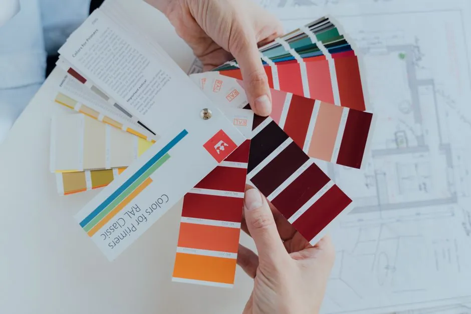
Shade cards lie, phone photos lie more, and a 2 cm chip tells you nothing about a 10 foot wall. Testing properly costs a day and saves a repaint. Where you can, test outside the October to December north-east monsoon, which the same climate tables identify as Chennai's main rain period, because paint dries slowly in damp air. The India Meteorological Department's Chennai page carries the city's current weather.
- Shortlist no more than three pairings.
- Paint sample patches of at least two square feet directly on the wall, two coats each.
- Put one patch on the brightest wall and one on the dullest wall of the same room.
- Look at them in the morning, at 3 pm and under your actual evening lights.
- Hold them against your floor, curtain fabric and largest piece of furniture together.
- Choose on the dullest-wall patch. If you still like it there, you will like it everywhere.
What mistakes send Chennai homeowners back to repaint?
When people choose home paint colours on their own, a handful of process mistakes cause most repaints, and almost none are about taste. We see the same ones on homes across the city.
- Choosing in the showroom. Shop lighting is cool and even; your living room is neither.
- Three colours in one room. Base, accent and trim already make three, and a fourth never settles.
- Ignoring the floor. A warm vitrified tile fights a cool grey wall, and the tile is not coming up.
- Matching the wall to the sofa exactly. Nothing recedes and the room reads flat.
- Choosing colour after the furniture is ordered. The palette should be fixed alongside the layout, which is how our home interior design packages plan paint, lighting and furniture together.
When should you call a designer instead of a painter?
You can pick a pair yourself for a single room. Ask for help when colour has to work across several connected spaces, or when the walls, ceiling and furniture are all being decided at once.
- An open-plan living and dining area with one continuous wall run.
- A full-home repaint where every room must feel related.
- Dark wood, coloured tiles or a strong ceiling design already fixed.
- Two people who cannot agree after the patch test.
The right wall colour combination is the one that still looks good on your dullest wall at 6 pm, with your furniture in the room.
Frequently asked questions
Which two colours work best together on Indian walls?
Warm off-white with deep olive, greige with terracotta and off-white with blue-grey are the safest pairs for Chennai light. In each case the lighter shade covers most walls and the deeper one goes on a single wall.
How many colours should one room have?
Keep it to a base, one accent and a trim or ceiling shade that is the base or a lighter tone of it. A third wall colour or a fourth shade rarely settles, and the room starts to look busy.
Which wall should be the accent wall?
Choose the wall you look at when you enter or sit down, such as the TV wall in a living room or the headboard wall in a bedroom. Avoid the wall that holds the main window.
Should I use matt or satin paint?
Use matt for the base walls, a soft sheen at most for an accent, and satin or semi-gloss only for kitchens, bathrooms and skirting. Chennai humidity makes washable finishes useful in wet areas.
Can I use a dark colour in a small room?
Yes, on one wall, or by colour-drenching a very small room such as a study. Dark shades on every wall of a 10 by 12 room make it feel closed in, especially in the evening.
How do I choose a colour that goes with wooden furniture?
Warm woods such as teak and rosewood suit greige, cream, olive and terracotta. Cool greys can fight them. Hold a large sample patch next to the biggest wooden piece before you decide.
Tell us your BHK size and budget band and the Style Well Interiors team will plan the colour palette with your layout and reply with a clear, itemised quote within 48 hours.
Tell us your BHK size and budget band — our team replies with a clear, itemised quote within 48 hours.